Monday, 25 August 2008

Kate Moross

Whilst in Topshop a few weeks back I was instantly attracted to a new range of bright psychedelic T-shirts. They were the work of 22yr old London based designer Kate Moross who I have since researched into more...

She has used her interlocking hand drawn illustrative style to produce work for clients such as Sony and Cadburys, has illustrated for magazines such as 'Vice' and 'Dazed and Confused', and has produced many a club/band flyer including the ones below for The Klaxons and Gossip.
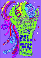
She was recently selected by Creative Review for the 'Creative Futures Scheme' which celebrates the best upcoming designers. I particularly like the work she produced for this scheme as she has mixed her bright, distinctive style with photography as shown below, which seems to work extremely well.

Tuesday, 12 August 2008

Word Clock

I recently came across this great idea for a screensaver designed by Simon Heys. A typographic clock "displaying a fixed list of all numbers and words sufficient to express any possible date and time as a sentence". Read the highlighted words to read the date and time...a fun, simple idea.
You can change the font, kerning, alignment etc. of the words to fit your own taste, and even change the colours. I did actually sit and watch it for a while just to see it change...who'd have thought a clock could be so entertaining!


To see/download the working thing, visit http://www.simonheys.com/wordclock/

Friday, 8 August 2008

Help I Need Help

A small company who wanted to make solving minor problems such as small cuts and headaches, simple and inviting. They designed friendly looking packaging for paracetamol and bandages, things you normally wouldn't look twice at. The company has simply "stripped away some of the complexity and fear mongering of the health industry". The packaging is also made from 100% recycled materials.

My favourite part of the website however is the section called 'help I am bored', which creates stupid problems such as 'help I'm topless' or 'help I'm drunk', and provides you with equally stupid, funny ways to overcome this problem. My personal favourite is the one for 'help I feel horny', the pop up being...
There are only 16 problems, I think they need more because they are very funny and fit in nicely with the theme of 'minor problems'. You can also buy help t-shirts...where you can personalise it and make your own problem for the front.
The company probably only started out making the packaging, but I like how they have created this whole help 'personality', to make an entire website.

Thursday, 7 August 2008

TDR

I studied The Designers Republic for A-Level graphics, and since visiting their 'Brain Aided Design' exhibition in 2005, have become a fan. They are a graphic design group based in Sheffield, and have designed for many famous brands/companies such as Gatecrasher, Orange and Coca Cola:

Their exhibition however showed the controversial designs that they are known for, a lot of which exploit the consumer culture we live in. I like the way they took some of the most well known brands out there, and cleverly used similar designs to mock us.

Below is 'Flesh Burger' - mocking the fast food culture by using a similar design to Burger King...putting devils horns on the burger instead of a crown, and the copy being things like '100% juicy dead animal'.

Then there is 'Work, Buy, Consume, Die' which is pretty self explanatory, using a symbol very similar to that of Coca Cola's.
The third is 'Wanker', which has flipped the McDonald's 'M' to make a 'W' on top of a half naked woman with a barcode type strip covering her eyes.

All straight to the point, and all pretty controversial. I just love the way they mock the very same culture and people who pay their wages, in such an obvious, sarcastic manner. Their website even has an online shop where you can buy TDR posters, book etc. I suppose it's hypocritical.


There are many, many more examples of The Designers Republic's 'anti-establishment aesthetics', here's the website: http://www.thedesignersrepublic.com/

Bunny Suicides

A hilarious book by Andy Riley which i'm sure you've all probably seen by now. As tasteless and cruel as it may be, you can't help but laugh at the cartoons. The drawings are very detailed, but still done in a fairly childish style, appropriate for the concept.

I had to include it as an example of a simple concept with endless outcomes...


D.A.N.C.E

I had to include this because its probably my favourite music video - D.A.N.C.E by Justice, directed by Jonas and Francois. The style of animation is playful and funky fitting perfectly with the song - the ever changing T-shirt designs are just fun to watch (designed by So Me - the in house artist of Ed Banger Records - Justice's record label).

Apparently a lot of the designs are references to personal friends, inside jokes, and past 'So Me' t-shirts, therefore the video probably does mean something, it is just a mystery to us, making it interesting and intriguing to watch. My favourite is 'Internet killed the video star' because it's so true.

The animation looks so effortless, I wondered how they got it so spot on... Jonas and Francois say 'We shot Xavier and Gaspard (2 members of Justice) wearing plain t-shirts with 4 pieces of black tape stuck to them to follow the movement of the fabric in post production.

Other music videos by the same director include Kanye West's 'Good Life', based on similar animation, and Justin and Modonna's '4 minutes'.

Guess Who?

A book by Noma Bar, an amazing artist who is able to portray a famous face using a few lines and drawn objects which reflect that persons personality, lifestyle or career. You can immediately tell who is who. She is known for her somewhat controversial designs, my personal favourite being her portrayal of Michael Jackson, where she used the outline of a small child for his eyes and nose. They remind me a little of Julian Opie's works, he too uses block colour and very few colours and lines to create faces each with their own character.


Harry Potter, Margaret Thatcher, Bob Dylan and George Bush

Code 46

A love story set in the future where almost everything is determined by genetics. It is directed by Michael Winterbottom, who has managed to portray the future in a somewhat believable way...there's no robots or anything like that, just the odd touch that aren't impossible to imagine, such as humans only being able to venture out at night due to the sunlight becoming hazardous, and there being a universal language that everyone can understand.
It is beautifully shot, and I think the thing that made this film for me is the soundtrack. It is kind of mysterious and haunting, fitting perfectly with the storyline, and even the style of camera work. It is one of those films that lingers with you for a while afterwards.

Alcohol: Know Your Limits...

The latest attempt to crack down on binge drinking - a hard hitting but brilliant concept for a campaign. There is a female version (shown below) and a male version, both showing them getting into a state before they head off out. The strapline being - 'You wouldn't start a night like this, so why end it that way?'

Whether or not the the adverts will be successful I don't know. The target age is 18-24 yr olds, a lot of which already 'know their limits' when it comes to alcohol, but will carry on drinking regardless. Either way the adverts certainly make you watch, cringe, and hopefully think about the message.


You can read more about this campaign at:
http://www.ias.org.uk/resources/publications/alcoholalert/alert200803/al2008_p5.html

Wednesday, 6 August 2008

Difficult is Worth Doing...

If you're as cool as me and were watching 'Come Dine With Me' a few months back, you'll have seen this...Britain's first live TV advert, for Honda.
I was pretty impressed with it considering things could have gone horribly wrong, but according to Honda 'Difficult is worth Doing'.
I was intrigued with the concept of a live advert, so I thought it was pretty genious, even if a little pointless...I don't think i'd have been as impressed if it wasn't live but I suppose it summed up the strapline. What do you think?

(Notice the dude who wrote 'Hello Mum' on his gloves. Brilliant)

Zoo Ads

I think these Saatchi & Saatchi adverts for San Diego Zoo are so clever.
The concept is pretty simple:
Zoo = Animals Together
...and the adverts quite literally do that in a striking, colourful way...perfect for children. They remind me of how Escher slots animas together in his designs.


'Animales Juntos' translates to 'Animals Together', However, these are universal...good for children, as you don't really need to know the language to understand and enjoy the images. 

Badly Drawn Roy

This is awesome...
A short documentary type film from Dublin based animation company 'Jam Media', about Ireland's first animated baby. Sounds stupid, but watch it and you will start to sympathise with Roy as if he were a real 'live action' person. A result of brilliant acting, brilliant traditional animation, and brilliant humour.


http://www.jammedia.ie/

Sleeveface

I'm not entirely sure where this idea originated from, but I first came across the facebook group 'sleeveface' a few months back, and it's since become huge...

The definition:
"One or more persons obscuring or augmenting any part of their body or bodies with record sleeve(s) causing an illusion."

Genius idea with some absolutely hilarious outcomes, some working better than others, but here's a few of my favourites: